Goodbye Lenin!


Goodbye Lenin is one of my favorite movies that I watched during my student days when I was studying international relations. My international politics professor recommended the film, and after watching it, I found it very engaging. It tells the harsh yet humorous story of a family, accompanied by the wonderful music of French musician Yann Tiersen.
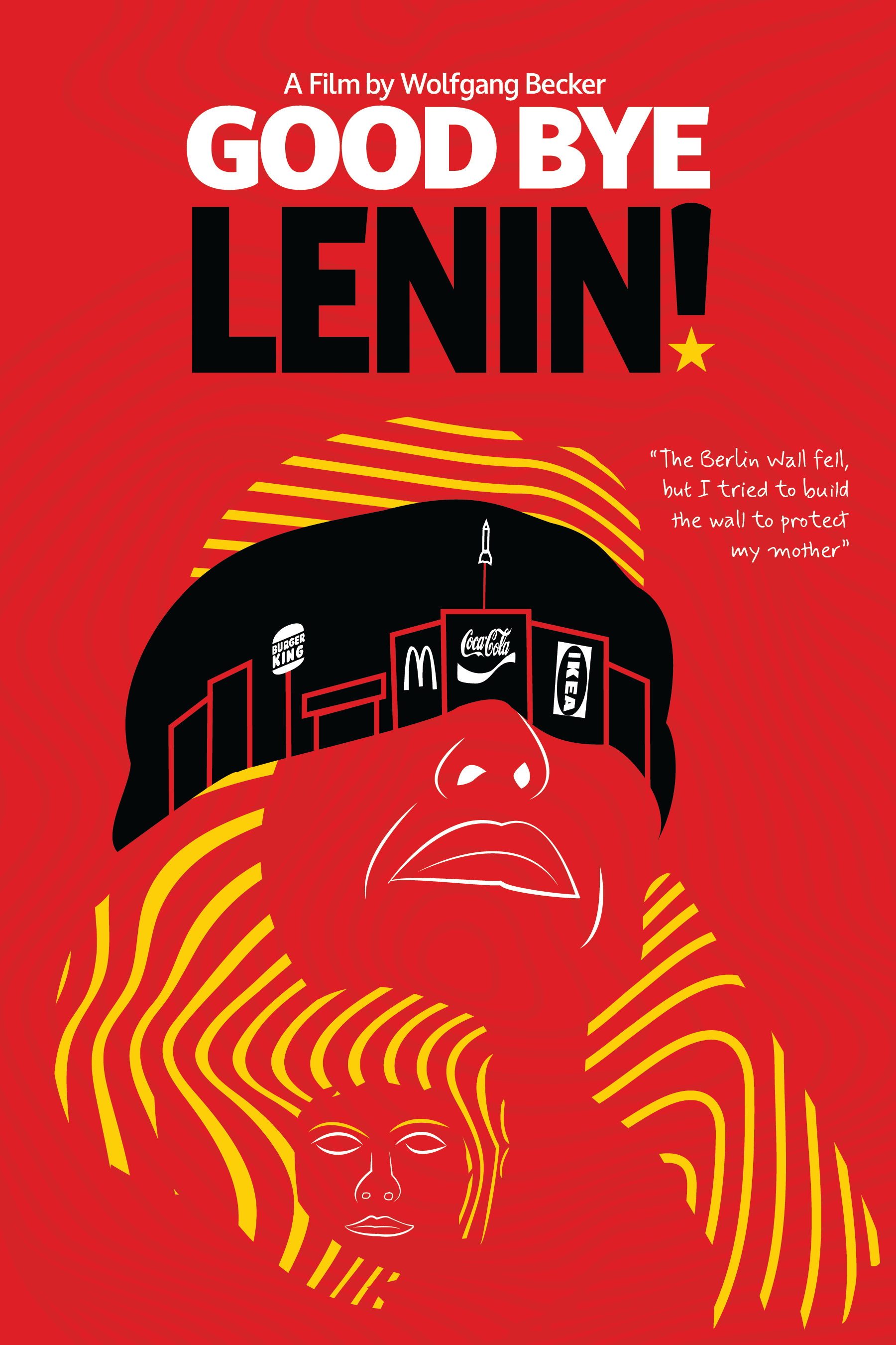
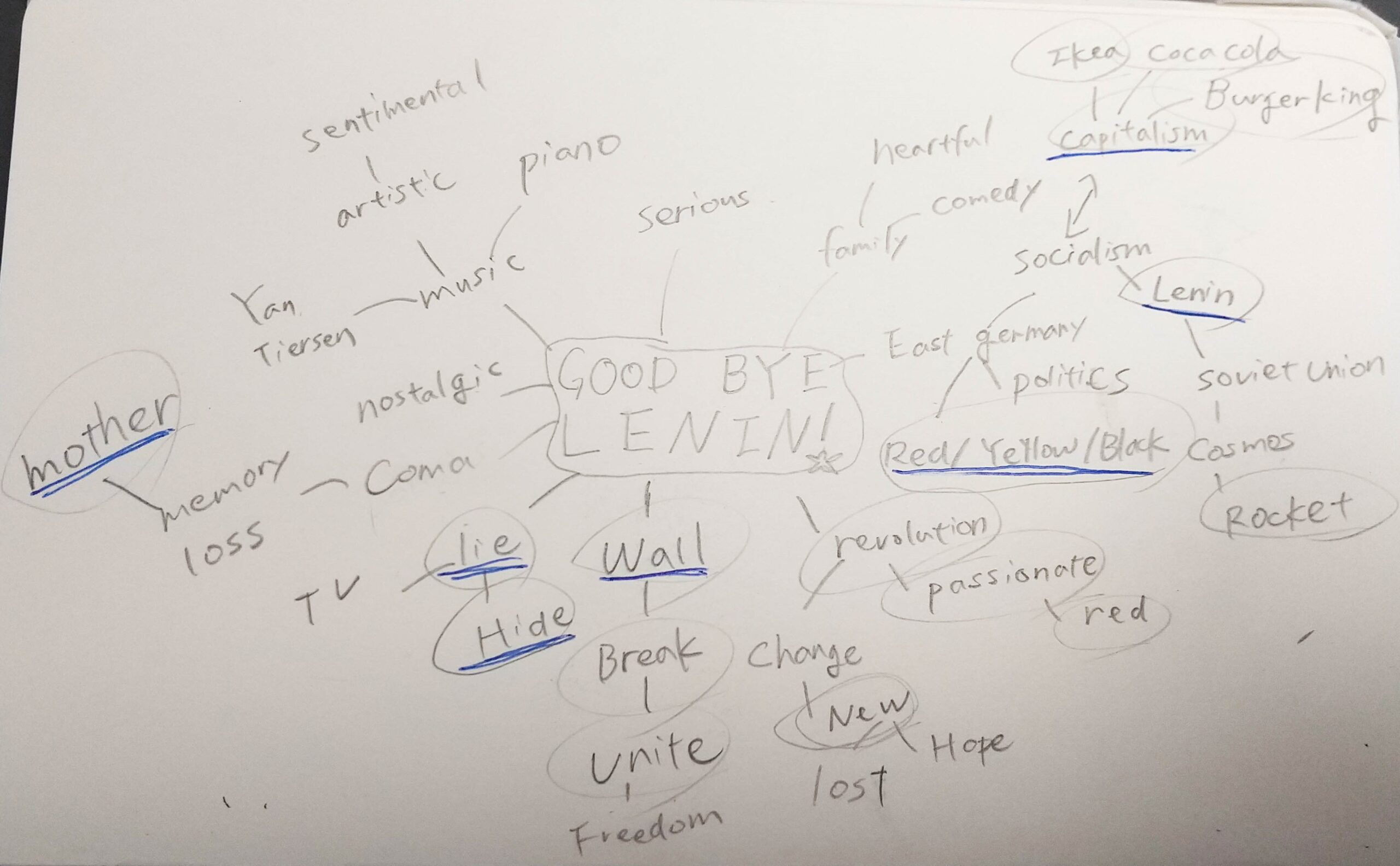
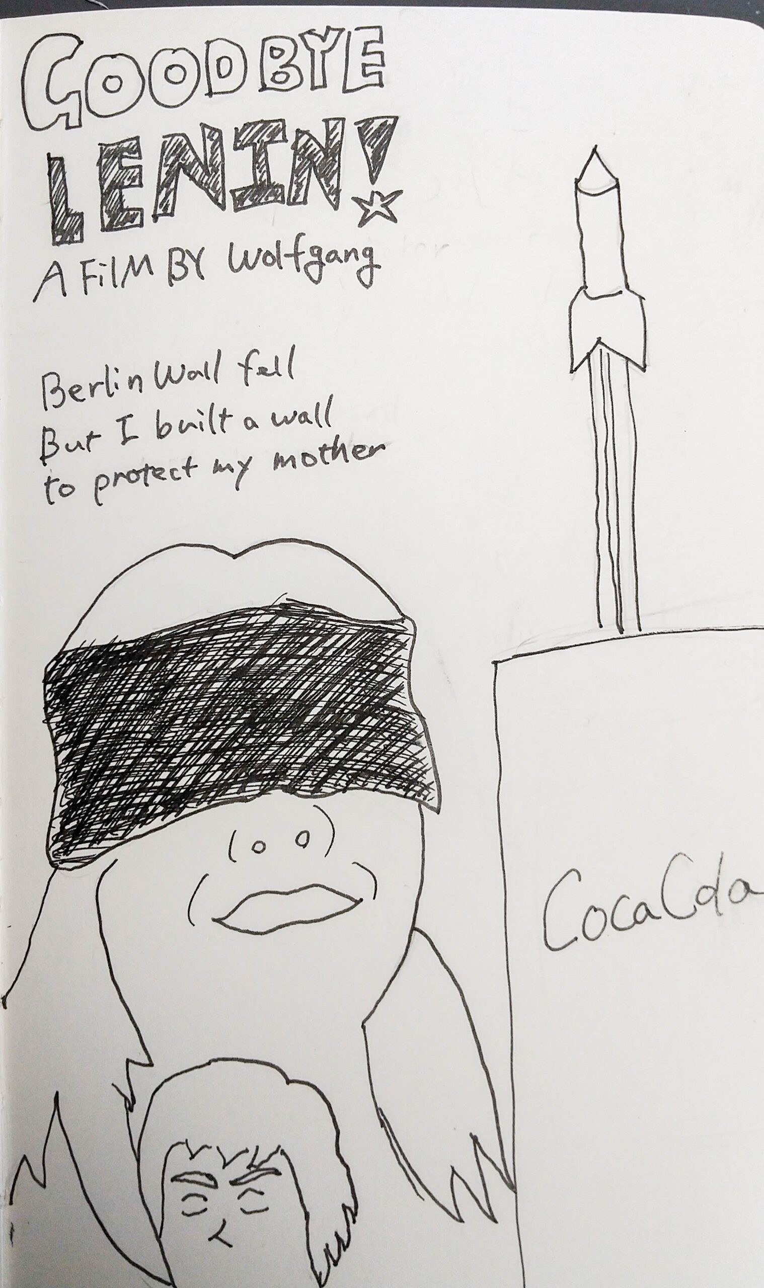
When designing the poster, I believed it was necessary to convey the essence of the movie in a single image. I started by brainstorming in my notebook. Thinking about the themes of the movie, words like mother, lies, hiding, wall, victory of capitalism, Lenin, and Soviet Union came to mind. I then made a quick sketch and initially planned to design the buildings on the right half and the characters on the left half. However, since the assignment was to create a minimalist poster design, I decided to reduce unnecessary elements as much as possible. By depicting the buildings within the eye mask, I was able to achieve a clean and minimal design. I also removed decorations from the buildings and unnecessary details from the faces.
For the colors, I used red, yellow, and black, which are the colors of the Soviet Union flag (I used the exact colors from the flag). My teacher commented that the colors seemed too reminiscent of McDonald’s, but I believe this indicates the success of the design. After all, McDonald’s is a symbol of capitalism, and the movie’s theme revolves around the victory of capitalism. I made the word “Lenin” and the eye mask black to draw the viewer’s attention there. For the caption, I used a handwritten-style font to give the impression that the protagonist was writing it directly.

